How to Design With Bold Colors Like a Professional
The colors incorporated into a room design have a major impact on the way you feel while in that space. Bright colors often make us feel happy and invigorated. But using bold colors in your interior design can be a challenge. You may like a lot of color in your home but aren’t sure how to make it work. You want to make an impact without it looking gaudy, tacky, or busy.
Ready to jump into the wild wonderful world of color? We’re reviewing how to decorate your home with bold colors like an interior designer. Keep reading for our expert tips.
Art Home Garden
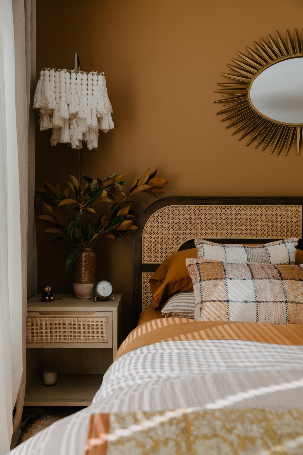
Create a Neutral Back Drop for Colorful Accents
The most tried and true method for designing with color is to go neutral with your main design elements, like walls, flooring, and counters. And then add more color and personality in your accent pieces like furnishings, window treatments, rugs, etc.
For your walls think earth tones, whites, and grays. White does a great job of really making an accent color pop. Then select a single accent color to really shine against your neutral backdrop.
You can also rethink what a neutral is. A deep color can act like a neutral, like deep blue or green, and then you can build your color palette around it.
Art Home Garden
Follow the 60-30-10 Rule
When designing a color scheme for a space, be mindful of the 60-30-10 rule.
This rule is really helpful when you’re using color. Think of your color pallet as three main colors. 60% of the room is your dominant color, 30% of the room is your secondary color, and 10% of the room is your accent color.
If you’re worried about going too bold a safe way to use this rule is to go 60% neutral, 30% more medium toned, and then 10% with a bold accent color.
Pendulum Magazine
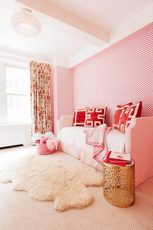
Focus on Solids, Rather Than Patterns
Especially if you’re new to experimenting with color, go with solid hues rather than a ton of pattern. This helps the space look clean rather than too overwhelming.
Or if you want to incorporate some colorful prints, go for prints with a limited color scheme. This way you can tie those colors into the rest of the space, so it looks intentional and not haphazard.
Decor Pad
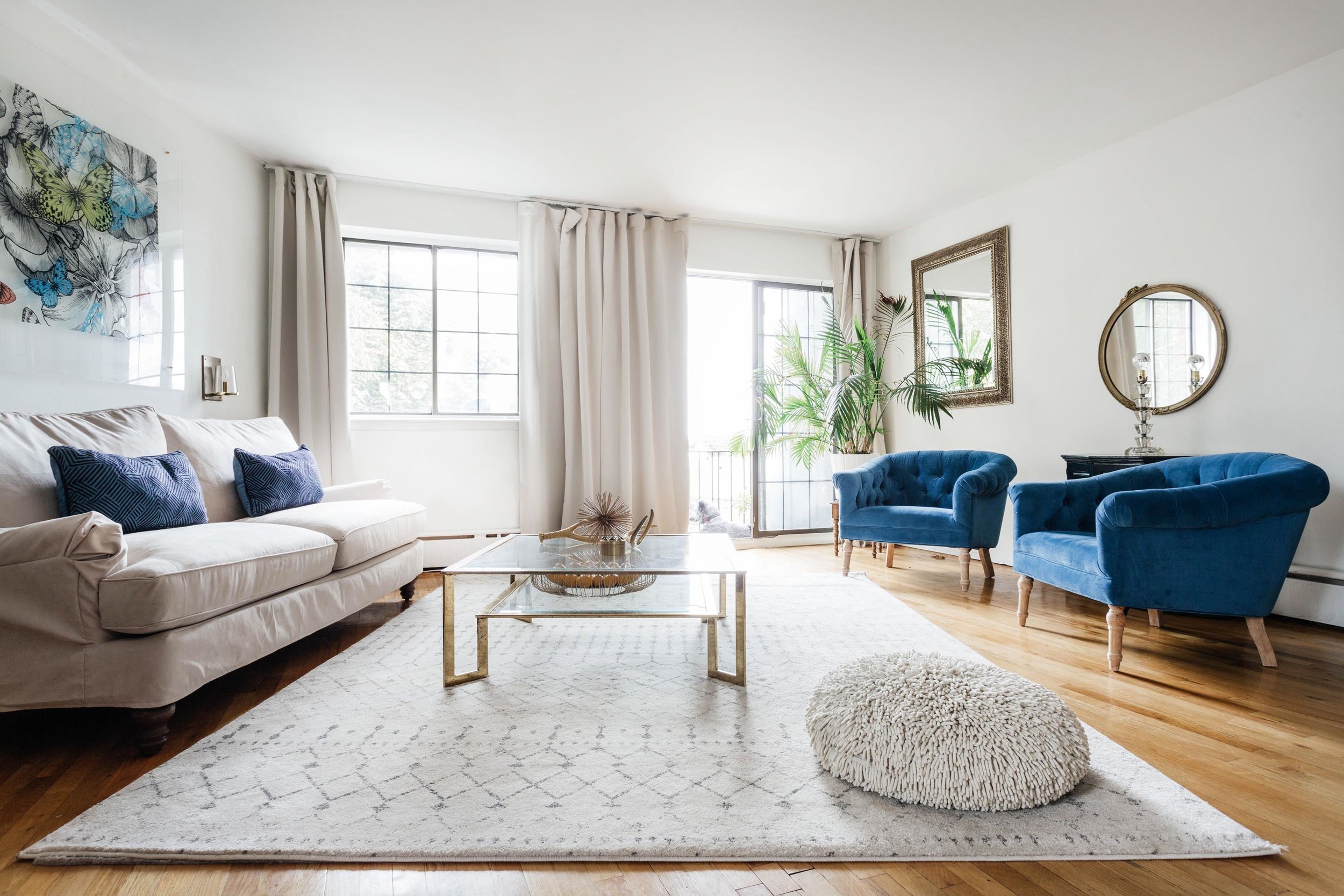
Pair Complementary Colors
If you want to play with more than one color, then pairing complementary colors is a good idea. We recommend choosing one main color to feature and then including accents in the complimentary color.
When deciding on what colors to pair, the color wheel is your friend. Classic complementary colors are opposite on the color wheel like blue and orange, red and green, and purple and yellow.
You can also go with split complementary colors, so instead of going directly opposite you look opposite on the color wheel and go one color over on either side of the opposing color. So like blue and amber or vermillion.
When deciding what colors to pair using a digital color wheel can help show you what colors work together.

Architectural Digest
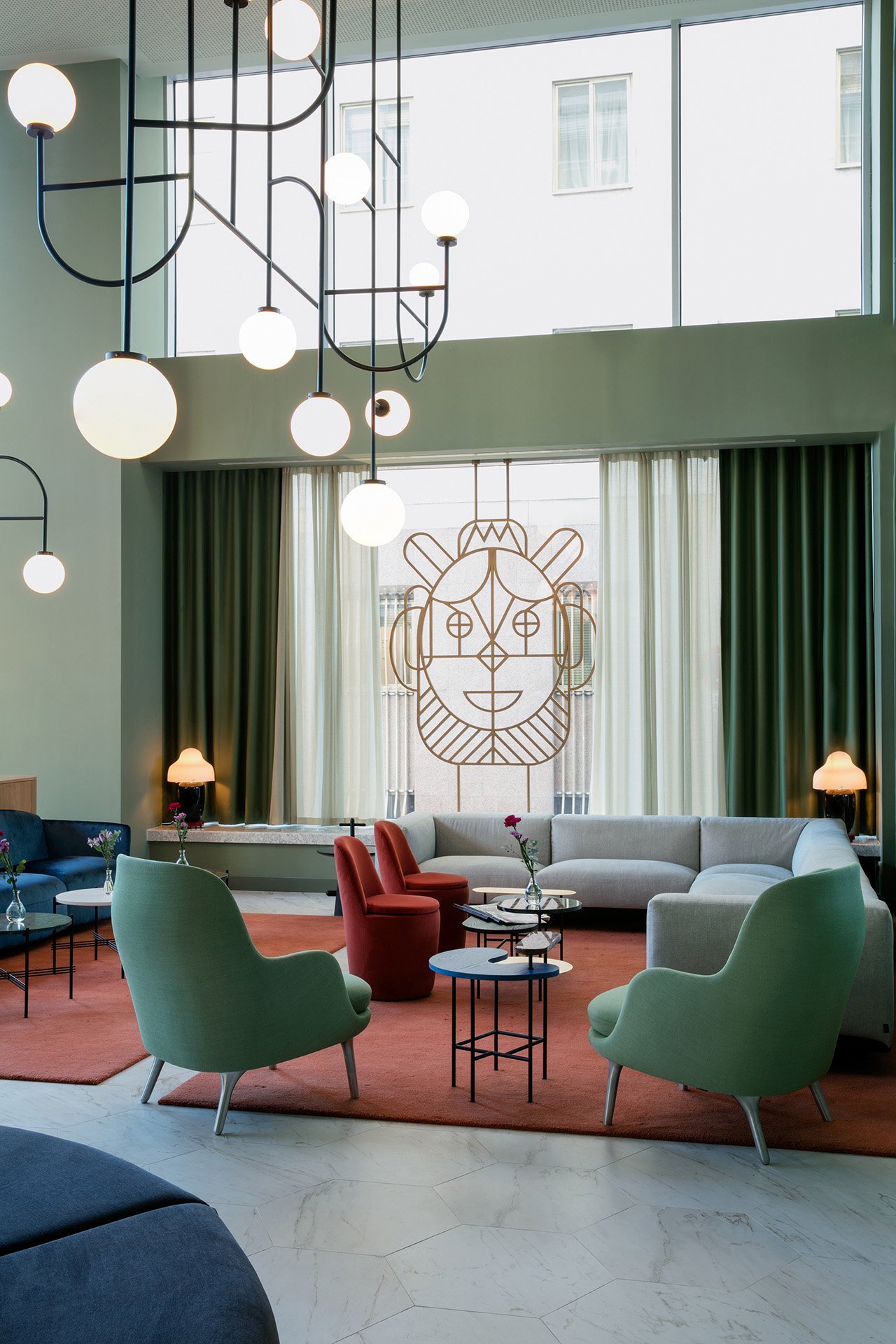
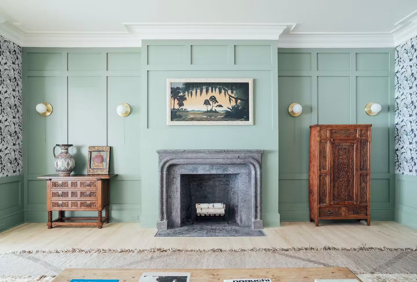
Combine Similar Colors
Another way you can have fun with color is to mix and match similar colors. Pair different shades of the same hue or go with analogous shades. Analogous shades are colors that are next to each other on the color wheel. It's a great way to create a sophisticated, more monochromatic look.
Cococozy
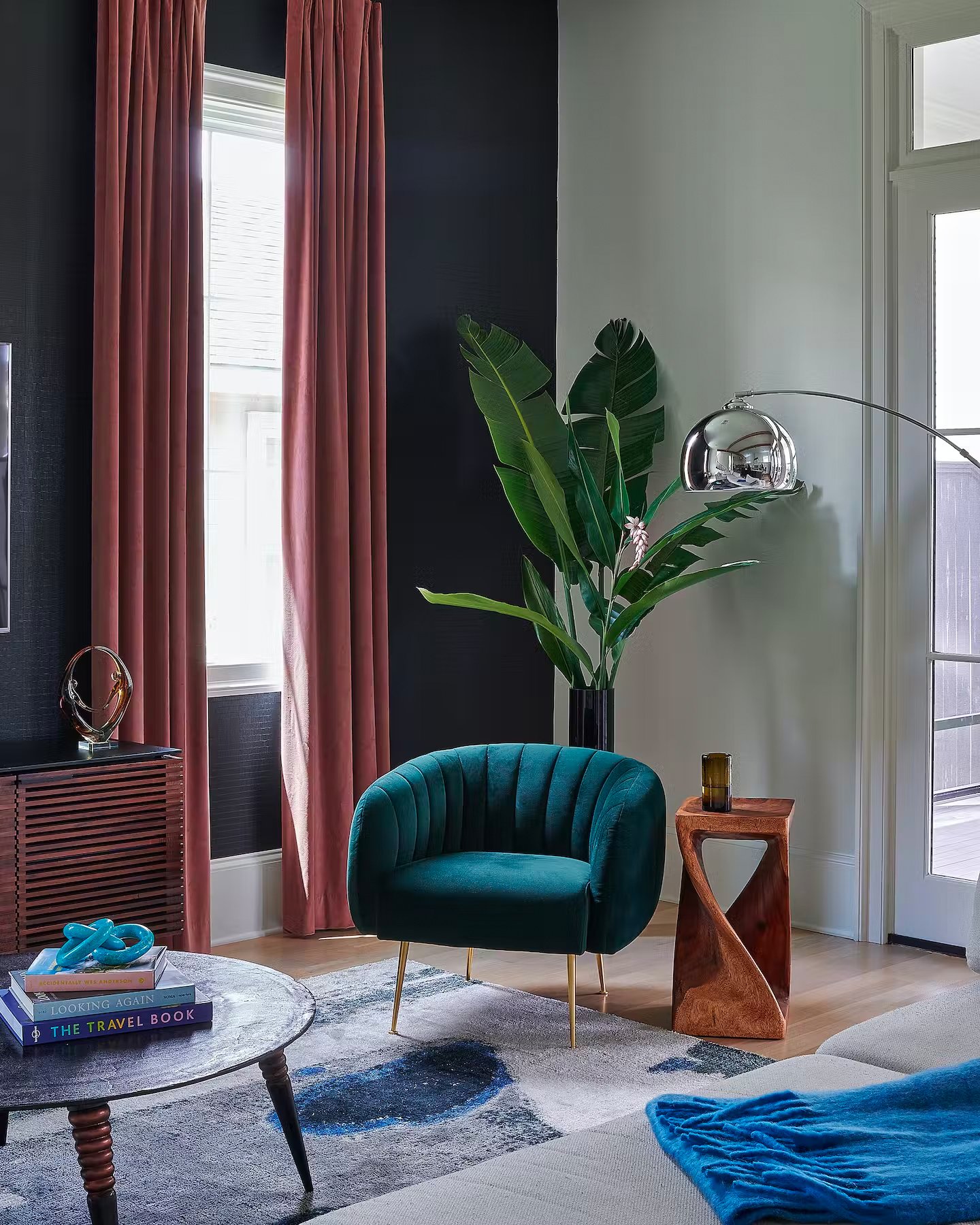
Go With Soft and Bold Colors
Or think of highlighting a single bold color and then pairing it with a soft accent color. Like a deep royal blue with champagne gold accents or a strong mustard yellow with a pale lilac.
Combining a bold color with something softer helps create balance.
Dwell
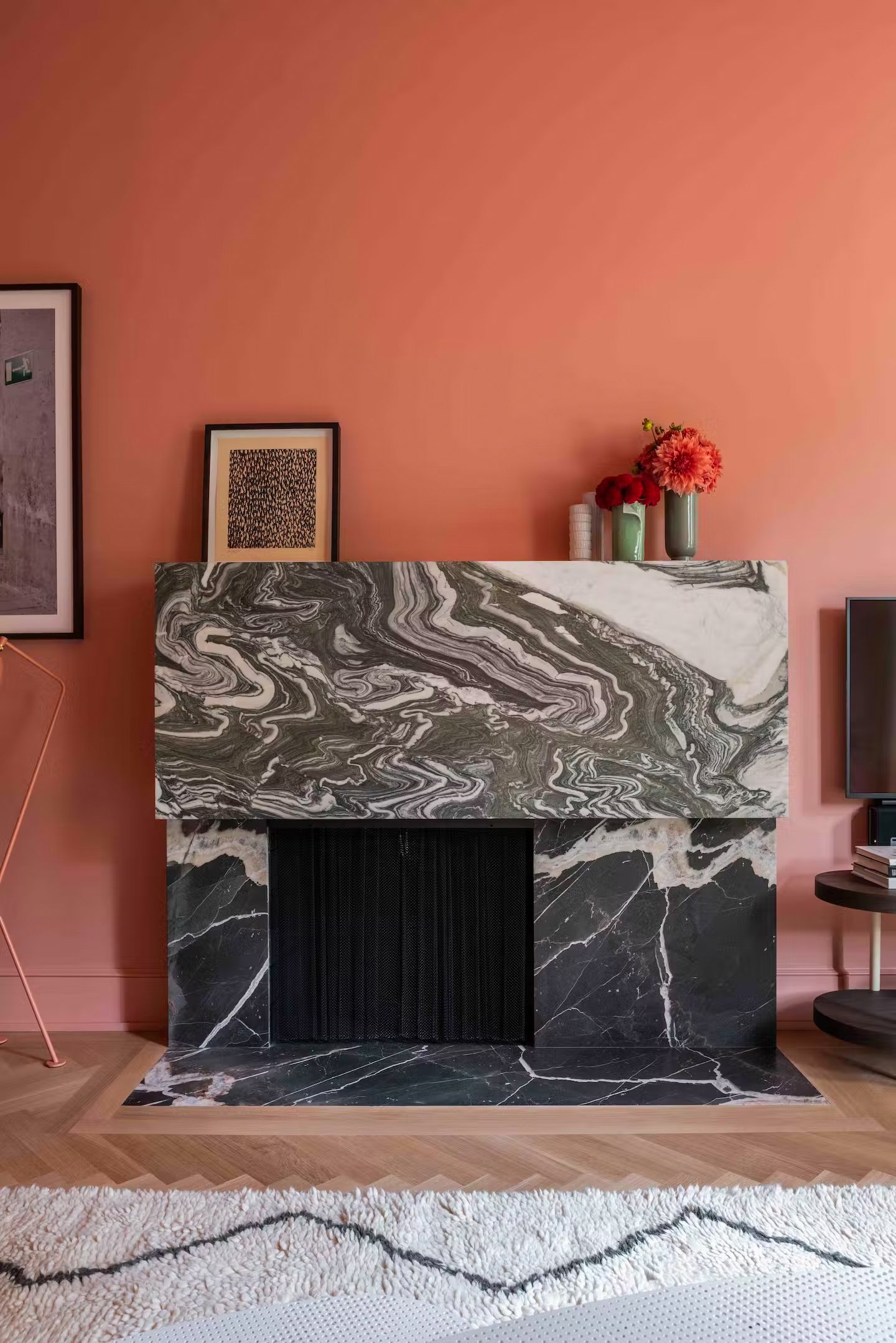
Bold Doesn’t Always Mean Bright
Keep in mind that using bold colors doesn’t always mean vibrant or bright colors.
You can make an impact with dark shades or rich hues. Or you can play with color by using lighter hues, they don’t even have to be fully saturated shades. Just think of the mood you want to create in the room and let that drive what types of colors you consider.
Dwell
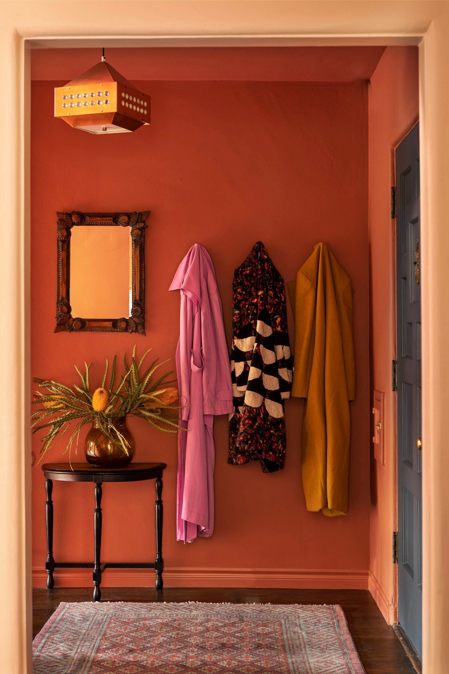
Use Bold Colors in Lower Traffic Rooms
Depending on the colors you like, the effects can be intense and amplifying which means you may not want them in the rooms you spend the most time in. Nothing says disruptive like a vibrant red wall in your bedroom when you’d rather have a more serene color palette.
Powder rooms, hallways, dining rooms, or other types of pass-through rooms are great to experiment with bolder hues.
Dwell
Get Professional Help
If you’re still having trouble landing on the right color scheme for your home then we can help! AHG Interiors is a full-service interior design firm. With experience taking on home design projects in a variety of homes and styles, we can create custom design solutions to fit your unique personality and lifestyle. We’ll guide you through the process so you can rest easy knowing you have an experienced team on your side.
Ready to get started? Get in touch with us today.