How to Style Your Bookshelves Like a Professional Designer
Have you ever wondered how interior designers and decorators style shelves so well? If you’re looking to spruce up your living room or bedroom shelving we have designer tricks to make your shelves look magazine-worthy.
Serena & Lily
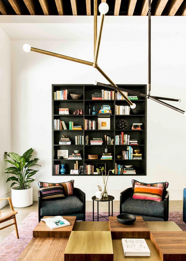
Decide on a Color Scheme
Whether you have built-in shelves, modern bookshelves, or single shelves, before you start styling them you’ll want to start with a clean slate.
You can then decide on a color scheme and aesthetic. Do you want mostly neutral decor? Pops of color? Black and white for a mod-inspired look?
Whatever you choose, it should be in line with the aesthetic of the rest of the room and your home. There are no hard and fast rules, but starting with a color palette and an idea of the overall aesthetic you’d like to achieve will help give you direction for the rest of the design.
Pro tip: When in doubt, go more neutral and add color slowly.
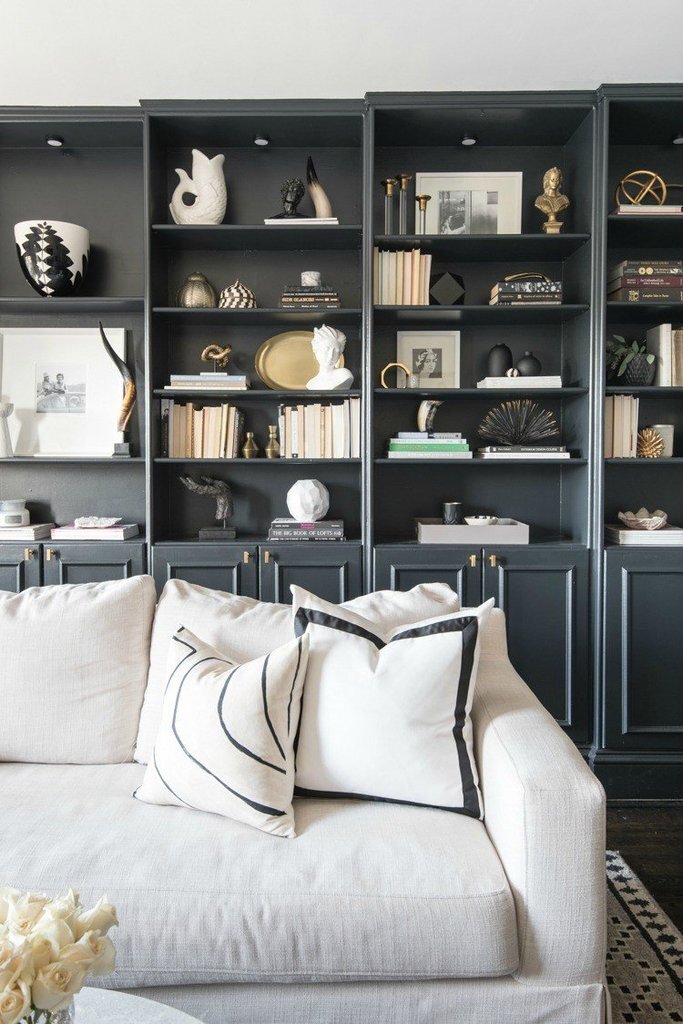
Studio McGee
Start with Larger Pieces
Once you have a general color palette selected, you can then start planning the layout of your shelves. Before you introduce everything you’ll want to start with the largest items and create focal points.
This could be artwork, a book collection, or another type of collection, whatever you want to display most prominently. Once you have your larger item(s) on your shelves you can then start designing around them.
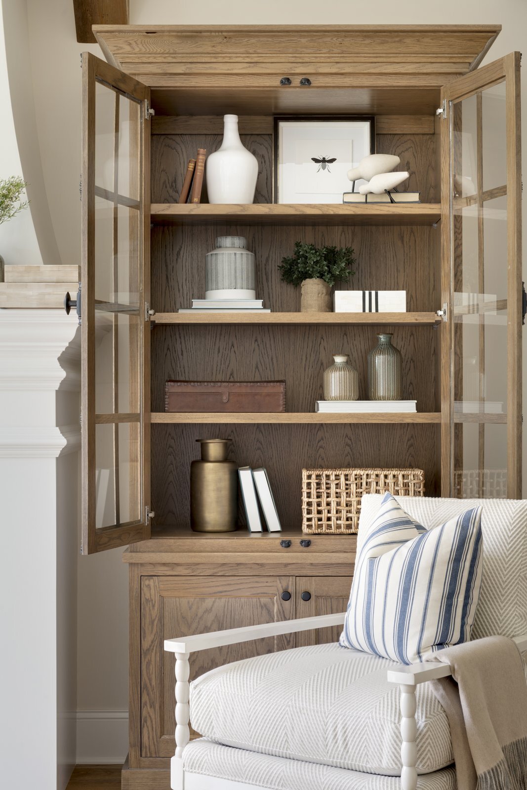
Dwell
Bring in Books, Artwork, and Decorative Accents
The next phase is to bring in more pieces, this could be more books, artwork, and/or decorative accents.
When you’re displaying books you’ll want to create thoughtful groups, rather than solid rows and rows of books like a library. To add visual interest you can alternate between stacks of vertical and horizontal books.
For artwork, you can layer larger and smaller pieces ranging from paintings, prints, drawings, and photographs.
When you’re gathering decorative objects, considering mixing in antiques or mementos from your travels. You can include, vases, sculptures, and other decorative items. We love the Linden Round Sculptures the marble and metal materials add interesting texture to the space and disk shapes contrast well with books. Group them all together or disperse them throughout your shelf display.
Get creative with your placement and layer artwork behind books and objects. Place smaller items on top of a vertical pile of books for different stacking effects.
Arianna Belle
Mix and Match Textures and Shapes
A great way to prevent your shelves from looking too matchy or boring is to bring in different textures and shapes.
A mix of books, woven baskets, and stone or metal objects adds some nice variation. Round objects can also contrast well with rectangular books. Incorporate a range of pieces at different heights and sizes.
A good rule of thumb is to evenly disperse the types of objects as well as their texture and color. This helps the display look organic and not overly curated.
Brooke & Lou
Add Some Plants
Adding some greenery introduces a nice pop of color and brings some life to your shelves. Have fun with hanging plants, potted succulents, or vines that create a beautiful draped effect.
There are many types of plants that work well indoors, but if you’re worried about the amount of natural light available you can make sure you move your plants over to a window with more light as needed.
Alternatively, there are also great realistic-looking faux plant options if you want something with no maintenance.
Play with Storage
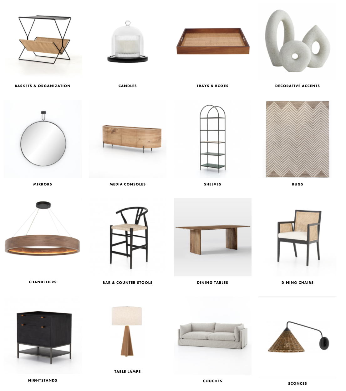
Include some decorative boxes and baskets to add some practical storage to your shelving while still keeping a stylish aesthetic.
We love the Hyde Tray. The modern and clean lines, along with the woven rattan detailing make it super versatile. Organizational pieces like this are also a great way to bring in some different sizes and textures to add more variety to the display.
Stand Back and Edit
This step is key! Don’t forget to step back and assess the whole look. Not everything you add to your shelves needs to stay. Also, you may want to try out different arrangements and groupings to see where things work best.
During the editing phase, be sure to move things around, add and subtract items. Ask yourself - does it look too cluttered? Is the balance off? Does it work with the rest of the space?
Amber Interiors


